When clicking on the menu options, the body of the page will be updated to show the directory of the selected entity. With a few exceptions, which will be indicated in the manual of each application, the directories will always have the same generic structure and functionality.
In the body of the page, we will observe:
- Name of the type of entity we are consulting (title of the directory).
- List with the elements of the consulted entity
- Toolbar with operations to perform on the entities
- Insights panel
Grid
On the grid, we will have a matrix in which we will be able to visualize all the elements of the consulted entity to which our user has access. In this matrix, a row will be shown for each of these elements, and some of the most relevant data of each element will be displayed in columns. The columns and the order of the rows can be customized by each user, as we will see in the section View. By double clicking on any of the rows, we will be able to open its detail's page. If we want to perform any other operation on a grid element, select the row and click on the corresponding operation in the toolbar. You can know whether a row is selected because it will be shaded blue during selection.
In the selected row we will see that the option to open the context menu of the element and activate, by clicking on the ellipsis icon () on the left side of the row. Clicking this icon will display the context menu, in which we will find different operations depending on the type of element we are consulting.
Finally, it is worth mentioning that there will be grids in which, at the beginning of each row, a checkbox will appear. Whenever this happens, it implies that the grid has bulk operations, which are actions available to be applied to several elements at once. To select several elements, you can check the boxes of the elements on which you want to perform the bulk operation. If you want to select several consecutive elements in the grid, you can do it in a simpler way by selecting the first of them, clicking the shift key on your keyboard and selecting the last one. In doing so, both the two manually selected and all those in between will be checked. If you want to make a selection of alternative items, you can do so by clicking the rows to be selected while holding down the Control key on the keyboard (Cmd on macOS)
Toolbar
Over every grid found on the app, there will be a toolbar, from where we will be able to access the following functionalities:
| Icon | Operation |
|---|---|
| Filter | |
| Create | |
| Edit | |
| Delete | |
| Refresh |
Afterwards, we will find a search bar, a view menu and export options. Occasionally, we will find additional actions that will be displayed depending on the application and the directory being consulted.

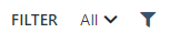
Filter section
The filter section consists of two elements: a view selector and an icon to activate the filter panel.
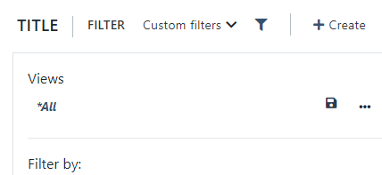
When clicking on the filter icon, we will see that a panel with filtering options is displayed on the left side of the window. This panel will contain a series of fields on which we can filter the elements displayed in the grid. The system is prepared to accumulate as many filters as necessary.
If you want to undo the filtering completely, at the bottom of the panel we will have a "Reset filters" button. Click on it and the grid will show all the elements again.
Save views
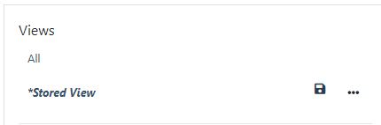
If you identify a certain search that you are going to perform quite frequently, you can save it, so that you do not have to repeat the filtering process every time you want to search for that information. You can do this by saving views. At the top of the filter panel, you will find a section called "Views", where by default "All" will appear. On the right hand side, with the three dots icon, you will be able to select "save as". This will enable a text field for you to provide a name for the view.
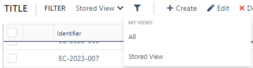
From now on, every time you access this grid, in the filtering section you can choose to display "All", or display the view you have created and saved.
If you want to edit or rename any of the views, you can do so as follows.
Edit view
- Select the view you want to edit from the view selector located in the filtering section of the toolbar.
- Open the filtering panel by clicking on the filter icon.
- You will see the filters that make up the view already selected and applied. Edit the filters as desired.
- At the top of the filtering panel, look for the name of the view you just edited, which will appear in bold and italics. Next to it, you will see a save icon appear. Click on it.
Rename view
- Select the view you want to edit from the view selector located in the filtering section of the toolbar.
- Open the filtering panel by clicking on the filter icon.
- You will see that the selected view is indicated in bold at the top of the filter panel. Next to it, you will see that an ellipsis icon appears. Click on it.
- A menu of operations will be displayed, among which you will have the "Rename option". Select it.
- The name of the view will appear in a text field, which you can edit as you wish. Make the changes and click with the mouse outside the text field. The name will be updated automatically.
Delete view
- Select the view you want to delete from the view selector located in the filtering section of the toolbar.
- Open the filtering panel by clicking on the filter icon.
- You will see that the selected view is indicated in bold at the top of the filter panel. Next to it, you will see an ellipsis icon appear. Click on it.
- A menu of operations will be displayed among which you will have the Delete option. Select it.
- A modal window will open from which you can confirm the view deletion operation. Select "OK" to proceed with the deletion or "Cancel" if you want to abort.
Publish view
The views that are created are by default, personal, so that only the users who have created them will be able to see and use them. If you wish to share any of your views with the rest of the system users, you can do so in the following way:
- Select the view you want to share from the view selector located in the filtering section of the toolbar.
- Open the filtering panel by clicking on the filter icon.
- You will see that the selected view is indicated in bold at the top of the filtering panel. Next to it, you will see an ellipsis icon appear. Click on it.
- A menu of operations will be displayed among which you will find the possibility to "Publish" the view. Click on it.
- A modal window will appear from which you can confirm the operation. Select "OK" to proceed with the publication or "Cancel" if you want to keep it private.
- When the publication of the view is confirmed, the system will offer you the possibility to create a private copy.
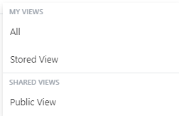
The views that are shared will be identified within the filtering panel with the icon. In the view selector that appears in the toolbar filtering pane, private and shared views will appear in two separate sections within the view selector.
Create new item
To create a new element, simply click on the "Create" operation of the toolbar. This will open a creation modal, in which you will be asked to enter the main data of the element you are going to create.
The required fields will be marked with a red icon. Once the information is completed, click on the accept button and the element will be created. At the end of the creation, the system will open the element detail screen, from which you can add additional information and trigger specific actions. You can see the detail in the section Fundanet Entity Details Page.
Until all mandatory fields are completed, the system will not allow you to finalize the creation of the element. Remember that the mandatory fields are marked with the red icon . In addition, at the top of the modal window, you will see a message indicating that the form contains fields that require your attention. As soon as you complete all these required fields, the message will disappear and the accept button will be enabled.
Edit an item
To edit an element, simply select the element to edit in the grid and click on the "Edit" operation of the toolbar. This will open the element detail screen, from which you can add, delete or edit the information of a specific element and its related elements.
This editing window can also be opened from the grid, by double clicking on the row of the element you want to edit.
Delete an item
To delete an item, simply select the item to be deleted in the grid and click on the "Delete" operation in the toolbar. This will show a modal for you to confirm whether you really want to continue with the deletion of the element or whether you want to cancel the operation.
To be able to delete an element, it is necessary for there to be no related elements. Suppose we have a project for which a pre-invoice has been created. If we try to delete the project, the system will return an error message, since the pre-invoice would be referring to something that does not exist. In order to delete the project it would be necessary to first delete all the linked elements that have a strong and direct dependency with the element to be deleted.
Refresh
The refresh button will allow you to update the information displayed in the grid. If there are several users working at the same time on the platform, refreshing the grid will allow you to see the elements that have been created by the other users since you initially accessed the grid.
Search
The search field will allow you to filter the grid elements by text strings that are being displayed on the screen. Unlike the filter panel, this operation will allow you to search for the same text string across several fields.
View
The system is prepared to customize the experience for each user, such as being able to choose which columns to view, the order, etc.
Sorting rows
By clicking on the header of any column, you can change the order in which the rows are displayed in the grid.
The system also allows you to sort the data by multiple columns. To do this, hold down the Ctrl key (or Cmd on Mac) and click on the headers of the additional columns you want to use as sorting criteria. The table will apply the sorting criteria in the order you selected the columns.
Example: If you first sort by the “Date” column and then by the “Name” column, the table will be sorted by date first, and within each date, by name.
Column ordering
If you want to change the display order of the grid columns, select any of them and drag it to the position where you want to display them.
Adapting the column's width
You can change the width of the columns displayed on the screen by clicking on their side border and dragging to the right or left. The system will adjust the size of the column live. When the desired size is obtained, release the mouse.
Column chooser
Apart from being able to reorder them, you can choose which columns you want to display. To do this, click on the VIEW toolbar menu and select the "Column Chooser" operation. This will open a list of all entity properties available to be displayed as columns.
Data grouping
You can also group the grid elements to get a nested data result. To do this, click on the VIEW toolbar menu and select the "Activate data grouping" operation. A bar will appear over the grid header. Select the column on which you want to group the data and drag it to the enabled area. You will see that the grid display changes to show the data in a nested way, grouping them based on the value of the selected column. You can concatenate different levels of nesting by adding new columns to the grouping area. You can undo the groupings again from the VIEW toolbar menu and select the "Deactivate data grouping" operation.
Export
From the export menu, you can select whether you want to export the information in Excel or CSV format.
Insights
Finally, on the right side of the toolbar, you will see an information icon from which you can show or hide the insights panel. This panel will show detailed information about the selected element, and links to related elements.