What is an entity details page
When working within the system, you will find that most information is placed in grids that show the data recorded in the system. However, not all the data is represented in columns, and there are additional pieces of information that can only be examined and edited from the entity details page.
How to access an entity details page
From a grid, you can access the entity details page by double clicking on any of its rows. You can also access this page by selecting a row and clicking on the edit button that is placed both on the grid toolbar or on the row's context menu.
Lastly, there are some clickable pieces of information. Those can be recognized based by the colors in which they are represented. Also, when hovering the mouse over them, you will find that they appear underlined and the pointer takes the form of a hand. When clicking on them, they will open to the details page.
Header
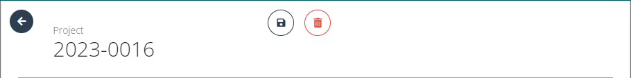
In the header of the details page, you will find the element identifier, along with two buttons to save and to delete the item. Also, in the top left corner you will find an arrow that will redirect you back to the previous page, closing the details page.
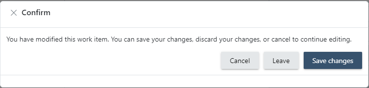
The details page can be used for viewing particular information about an item that may not be displayed in the main grids, but can also be used for updating, adding, removing or changing any piece of information. For the changes to be correctly saved, you have to click on the save button displayed in this area, otherwise your changes will be lost. If you try to leave the page after making changes, without saving them, the system will display a warning message informing you that there are unsaved changes, and provide you with three available options:
- Cancel: you will remain on the details page so that you can keep working on the edition of the item.
- Leave: the changes will be discarded and the details page closed.
- Save changes: the changes will be saved and the details page will be closed.
Toolbar
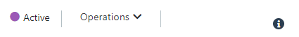
The toolbar of an item will vary depending on the type of entity they belong to. However, they will always follow the same pattern, having up to three sections:
-
State: placed on the left side of the toolbar, you may find a colored piece of information indicating the status of the element.

-
Specific actions: a set of specific operations available to be performed over the item. They could include change of status, detailed exports or...
-
Insights Icon: on the right side of the toolbar, you may find an icon that displays the insights panel.
Hide/ show sections
You will find that the content of the entity details page is organized by sections. If you click on the title of each of these sections, its contents will collapse or maximize. When you collapse a section, key information is shown in summary form.
Fields and how to fill them
There are multiple fields to work within:
- Single-select: A single-select field allows you to choose one option from a predefined list. Only one selection can be made at a time. Once you click on the field, a dropdown menu will appear displaying all available options. Click on the desired option to select it. If there are too many options and you already know which one you want to choose, you can type your answer and the system will filter from the displayed options. If you want to change your answer, you can just display the dropdown once more and select the new option. If you want to remove the selected option, you will find a cross icon that will empty the field when clicked on.
- Multi-select: A multi-select field enables you to choose multiple options from a predefined list. You can select more than one option by clicking on each desired item in the dropdown menu. If there are too many options and you know which one you want to choose, you can start typing your answer and the system will filter the options displayed. To remove a selection made, simply click on the selected item again or use the provided remove button. If you have selected several answers and want to remove them all, you can empty the field by clicking on the cross icon that is displayed when hovering over the field.
- Toggle: A toggle field allows you to switch between two states, typically represented as "On" and "Off." It is usually displayed as a switch or button that you can click to change its state. The current state of the toggle will be highlighted.
- Text: A text field allows you to enter a single line of text. It is typically used for short, freeform responses such as names, titles, or short descriptions. The text you enter should fit within the provided space.
- Textarea: A textarea field is similar to a text field but allows for multiple lines of text. This field is used for longer freeform responses, such as comments, descriptions, or detailed information. The textarea will expand to accommodate your text.
- Date: A date field allows you to select a specific date. Typically, you can either type the date in the required format or use a calendar selector to choose the date. Ensure that the date is entered correctly according to the format specified (I.E., MM/DD/YYYY).
Insights Panel
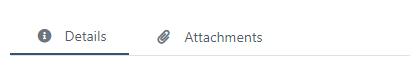
The Insights Panel can be shown or hidden by clicking on the insights icon and provides an overview of the item as well as links to related information. It is divided in two sections shown as tabs on the top of the panel: "Details" and "Attachments".
The Details Section
The Details section of the Insights panel shows a quick overview of the main information regarding an item. In this section, as well as a summary of the item, you may find links to other related entities. This links can be presented in two different forms:
-
Clickable texts: This will open the details page of the related element.

-
Pill buttons: This will open a list of linked items.
-
Cue items: This will open a main grid filtered by the original element.
Also within the insights panel, depending on your user role, you will find a security access section from which you will be able to determine which users have access to the element, either individually or by groups. You can find more detailed information on how the security works for each entity in the specific chapter of the app you are using: Site CTMS, Fundraising, Anify, IEC.
Lastly, in many of the elements you may find a timeline in which the main events that have happened to the element will be recorded. Those events will be placed chronologically and will allow you to get a snapshot of the current state of the item and its most recent history.
The Attatchments section
In the Attachments section, you will find both attached files and notes.
Linked files
The linked files will be presented through a pill button. Clicking on it a modal window will open showing a tree of folders on the left side of the screen and the files contained in the main body of the window.
Folder tree list
The users will be able to create a treelist of folders in order to have the documentation organized as they please. It's important to note that there will always be a parent folder from which everything else will hang. This parent folder will be called Files and cannot be edited under any circumstance.
You can create new folders underneath this one, by simply right-clicking on it and selecting the option Add.
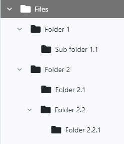
You will be able to create as many levels of information as desired, giving the folders customizable names. If you right-click on any of the folders that have been manually created by users (any folder except the root), you will be able to create new folders underneath it, rename it or delete it.
Please note that if you decide to remove a folder, all files contained in it will be lost, and the users will not have any means of documentation recovery.
Uploading documents
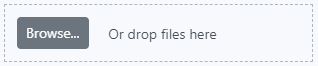
To upload a document to any of the folders, first you must select the folder you want to upload the file to. Once selected, in the body of the page you will see a list of all the documents contained within the chosen folder. You can add new ones from the right side panel, by either dragging and dropping documents from your desktop to the marked section or clicking on the browse button.
Notes
The notes section is a feature that allows users to leave comments for one another without saving data into an item.
Creating a new note
In order to create a new note, simply click on the "Add Note" button. This will open a window in which you will be able to include the message and indicate who you want to address the note to. The recipient of the note can be one or multiple individual users of the application. You can also address the note to everyone belonging to certain groups or roles.
Each user will have a list of all the notes that they have received (either individually or role-based) in the notes section of the dashboard in the application.
Managing notes
Once a note has been created, there will be four actions that you are able to perform, depending on your user capabilities. These actions can be displayed by clicking on the advanced options icon placed on the left side of each note:
- Edit: the user that created the note may edit it to update the content of the message or change the list of its recipients.
- View: the details of the note will be opened in read-only mode so that you can see the full message.
- Mark as read/unread: if you want notes to be displayed/hidden from the list of notes shown in the dashboard, you can do so by changing their status between read and unread.
- Delete: some users may be able to delete notes.